by John Barrat

Jan Stuart in the exhibit “Red: Ming Dynasty/Mark Rothko” (Image by Freer|Sackler staff.)
Luminous. Luscious. Velvety.
Sensuous adjectives for a dish perhaps, but words used by scholars nonetheless to describe the exquisite glaze of a rare copper-red piece of Chinese ceremonial porcelain made 500 years ago during the Ming Dynasty ( 1368-1644). Crushed raspberries are what the glaze calls to mind for Jan Stuart, the Smithsonian’s Freer Gallery of Art and Arthur M. Sackler Gallery’s Melvin R. Seiden Curator of Chinese Art. “Pulpy raspberry reds punctuated by little dark seeds,” are what her eyes see. “Certain bits of its color coalesce where you get almost dark speckles.”
Uncanny is how Stuart also describes the visual similarities between this dish and a series of oil and acrylic paintings done by American painter Mark Rothko in 1959, initially planned to decorate a luxury dining room in New York City. In both dish and Rothko paintings, “the unstable, subtly shifting hues touch our imagination, reminding us that color not only results from materials and processes but also transcends time and place,” Stuart writes in the exhibit text.
“The potters, of course, could have never envisioned a Rothko painting and we are all pretty certain Rothko never saw a Chinese copper-red glaze dish,” Stuart adds. (Rothko, a prolific writer, never mentioned anything about ceramics and Chinese ceramics in particular.)
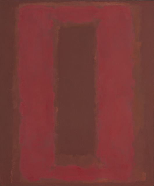
Untitled – Seagram Mural sketch Painting, Mark Rothko 1959, Oil and acrylic on canvas. Gift of the Mark Rothko Foundation, Inc. National Gallery of Art (© 1998 Kate Rothko Prizel & Christopher Rothko / Artists Rights Society (ARS), New York)
“The similarities are completely coincidental,” Stuart says. Yet nothing is coincidental about the artworks themselves. Both are the work of masters at the peak of their abilities, each consciously striving for control and perfection some 500 years apart, and achieving effects that echo each other.
Juxtaposition
Newly acquired by the Freer and displayed in the conjoined Sackler building, the dish now shares a small room with a single painting by Mark Rothko in the new exhibit “Red: Ming Dynasty/Mark Rothko.” To not distract from the experience, dish and painting are the only objects in the room. Exhibit text is on the walls of a separate entry/exit chamber.
“You can either read the text before, or after, or not at all,” Stuart says. “I very much wanted to separate it in the sense that I wanted people to know you can experience these two objects without even asking yourself when they were made or what they are. It’s really your choice, but I want you to have the experience of red.”
Stuart conceived of “Red” after showing the dish to various museum staff and others as it was being considered for acquisition. “On more than one occasion someone said to me they saw Rothko in the glaze,” Stuart recalls. “So it made me start thinking: OK. Is this a way to excite people,” by displaying the dish with a Rothko painting?
She began looking around at Rothko paintings at the National Gallery. “Then suddenly I realized, Perfect. I saw the same palate, exactly the Rothko that some knowledgeable art connoisseurs were seeing.”
She contacted Harry Cooper, head curator at the National Gallery of Art, who reviewed her exhibit proposal juxtaposing the two pieces in a single room. “I was thinking he might say to me ‘Oh no. This is crazy.’ But he was just delightful and supportive.” Cooper and National Gallery director Earl Powell agreed to lend the Sackler a Rothko painting to be exhibited with the dish.

Dish with copper-red glaze, Ming dynasty, Xuande reign (1426-1435), China, Jiangxi province, Jingdezhen. (Purchase: Charles Lang Freer Endowment and Friends of the Freer and Sackler Galleries)
Depth and variation
In 1959, Rothko (1903–1970) was layering red pigments in daring ways, achieving depth and variation that make his flat canvas seem palpable. Rothko believed that color was a portal to emotion and that art could change a viewer. “Rothko was painting very consciously, thinking about the emotional impact of his work, the visual impact of his work…consciously thinking, laboring over every stroke with what effect he’s going to get,” Stuart says. “He was concerned with the texture, he wanted shape, he painted the edge of his canvas and never wanted them framed.”
What Rothko was doing consciously is echoed exactly in what the master Ming potters were doing but with a totally different mindset. “What they were creating they did not regard as art,” Stuart explains. “They were carrying out an imperial command to produce a perfect dish to be used in a ritual ceremony. They were concentrating on it, I think, as technology, trying to achieve the single hardest glaze color to make, which is red, and they created a glaze with depth and texture.”
The potters learned that giving the dish a narrow white rim made the red color pop even more. They were also concerned about shape. “It is just this uncanny parallel of Rothko, and yet not a single thing in their thought process was consciously the same.”

“Red: Ming Dynasty/Mark Rothko” at the Arthur M. Sackler Gallery. (Photo by Freer/Sackler staff)
Subtle variegation is what gives the glaze of the Ming Dynasty dish its visual depth and reveals the technical mastery of the potters. Using a technique in which nanoparticles of copper oxide colored the glaze, the potters achieved a tone in the bluish end of the vermilion spectrum. “If you look at the glaze under high-powered magnification you see it is a network of bubbles, mostly unbroken. These bubbles are of two types and shades of reds, and form into networks; and the way they are mixing is non-homogeneous, so they’re refracting and reflecting the light in a complex way that gives that sense of depth and texture,” Stuart says.
“And if you look really closely at the glaze you will see some tiny, tiny pinprick holes—sometimes described as an orange-peel effect. Those are some of the bubbles that broke, due to the great heat in the kiln. But most are still unbroken and that is what reflects and refracts light in such a complicated pattern. Certain bits of the color coalesce where you get almost dark speckles in it…that’s why I always think of crushed raspberries,” Stuart says.
“Sometimes for me I stand in the exhibit and feel like I am almost weeping with the beauty of red,” Stuart reveals. “It’s all about all of the different tonalities of red, it is what really brilliantly thought about layering of color tones can do to open your emotions, making you feel happy, sad, everything.”
(“Red: Ming Dynasty/Mark Rothko” is on view in the Sackler Gallery through Feb. 20, 2017.)